The in-it web platform is currently in development and will launch in the near future - as such there are some secret things I can't show at the moment. But for now here's a look at some illustration work for the pre-launch website.

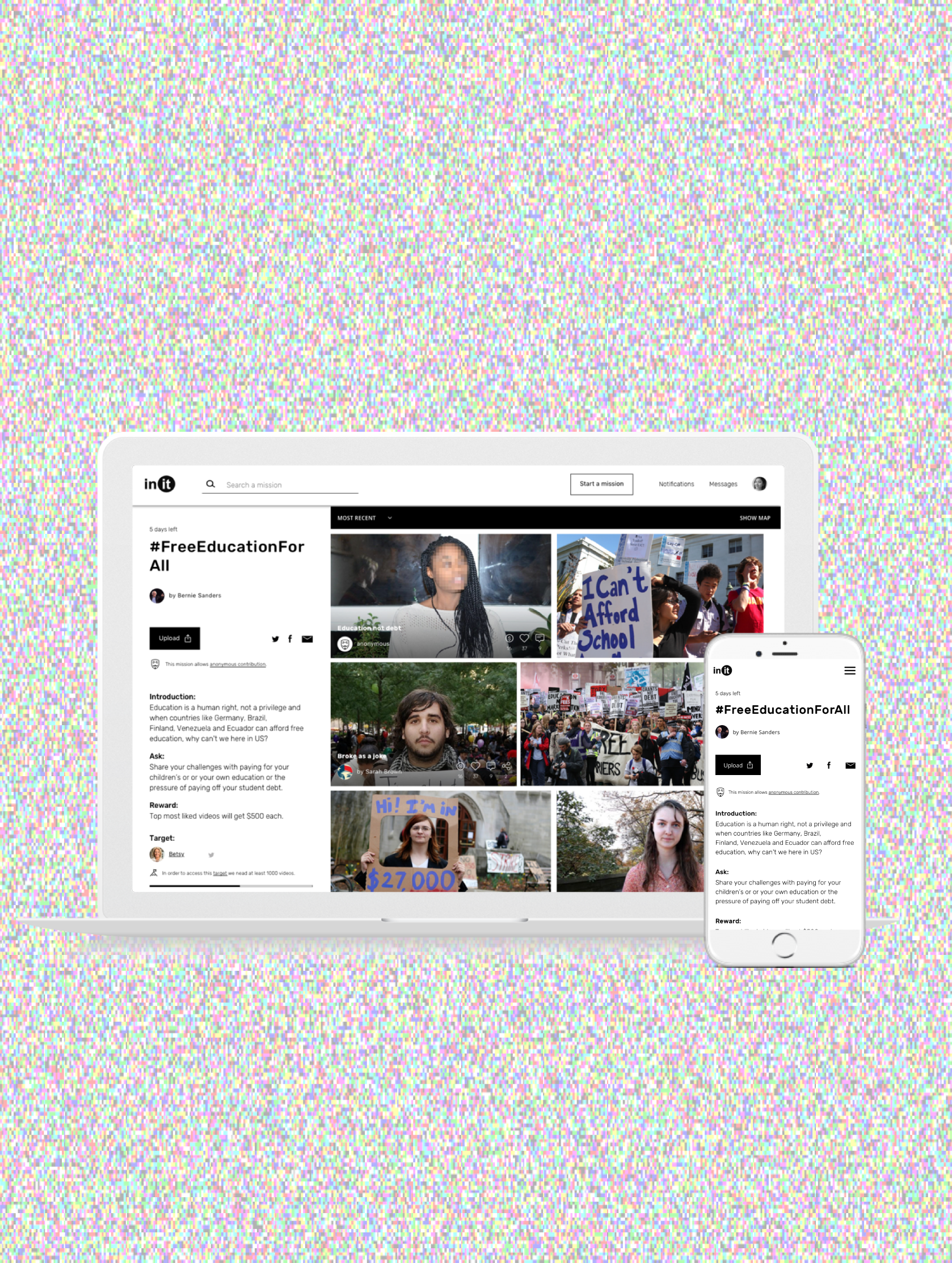
In-it is a start-up company out of Portland, USA. The company's focus is to facilitate story telling for people all around the world and to become a destination where engaging discussions are being held and everyone's voice can be heard. The web/web-app platform is centered on sharing user created guerrilla-style video content; all topics are fair game, from lifestyle and entertainment to politics and current events.
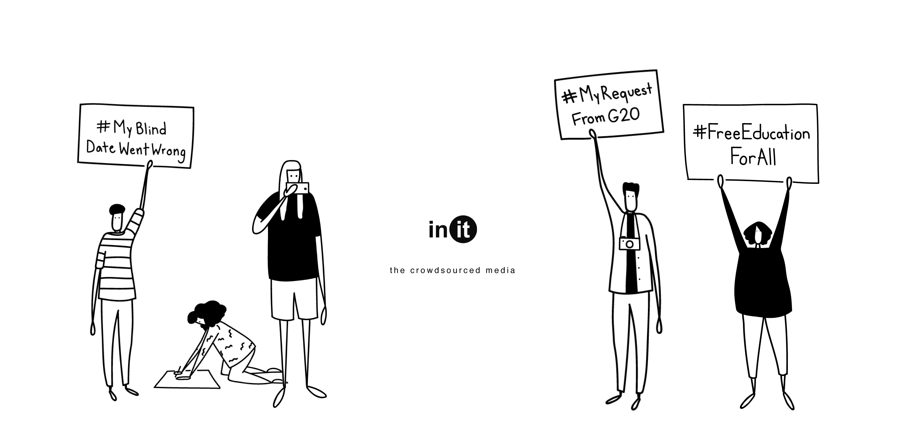
My contribution to this platform was mostly visual design/experience thinking. I started off working on branding for the platform and moved into visual design and concept ux thinking for two of the main pages of the platform.
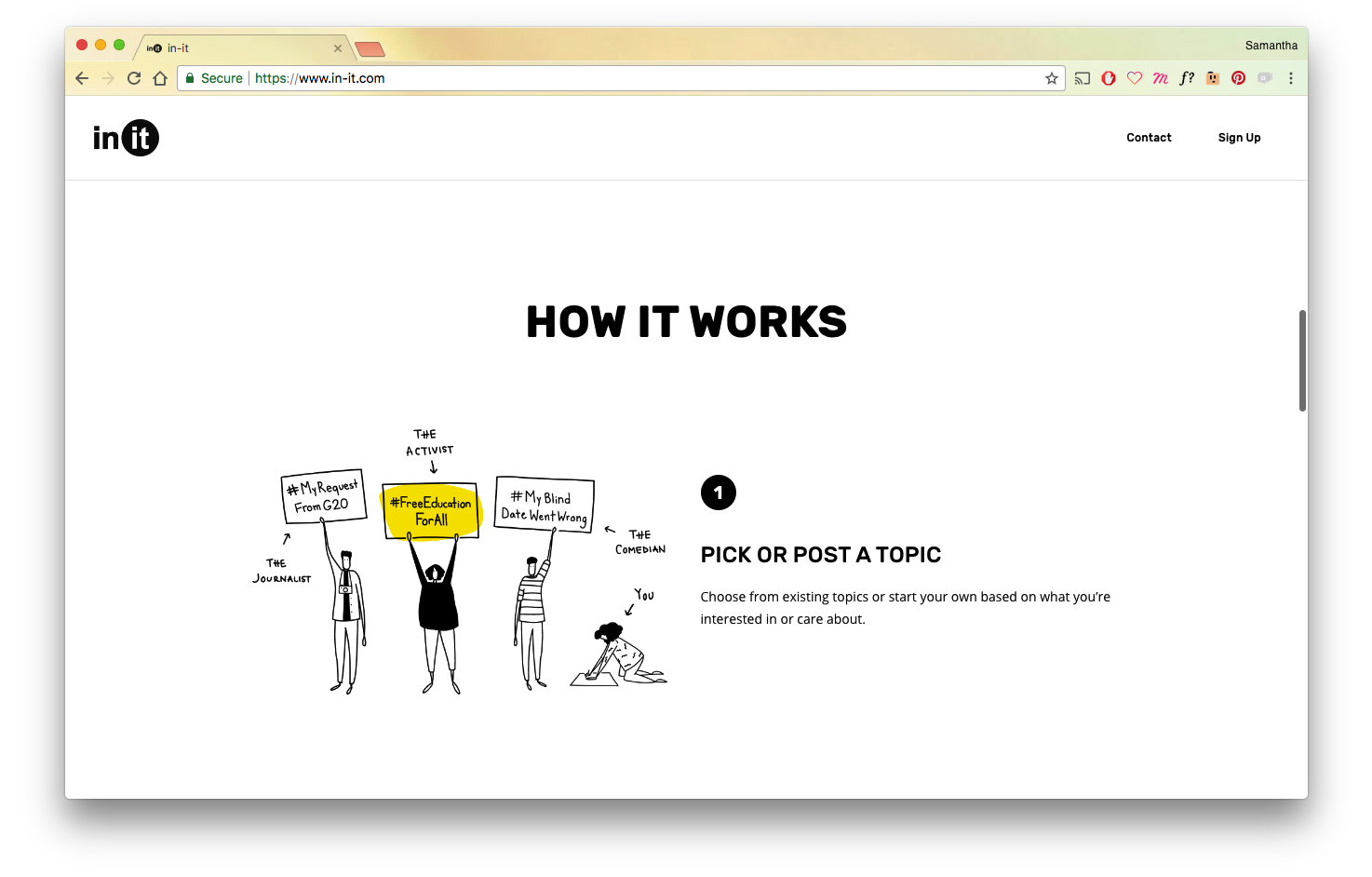
In order to create a place where many of people could contribute content daily, the design of the platform needed to be scalable and flexible to the irregularities that come with social media. In the same way, embracing a level of polish that communicated transparency and evolution rather than certainty and complete order was an important part of the overall branding and experience strategy.
For the illustrations, I proposed two different styles of the same scenes. The second option B (on the right) fit the overall feel and scalability that the project needed and we ended up going with that. After picking a direction, I continued to iterate on the content and communication of the images to best correspond with the text to communicate the breakdown as simply and thoroughly as possible.
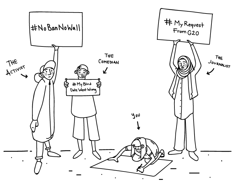
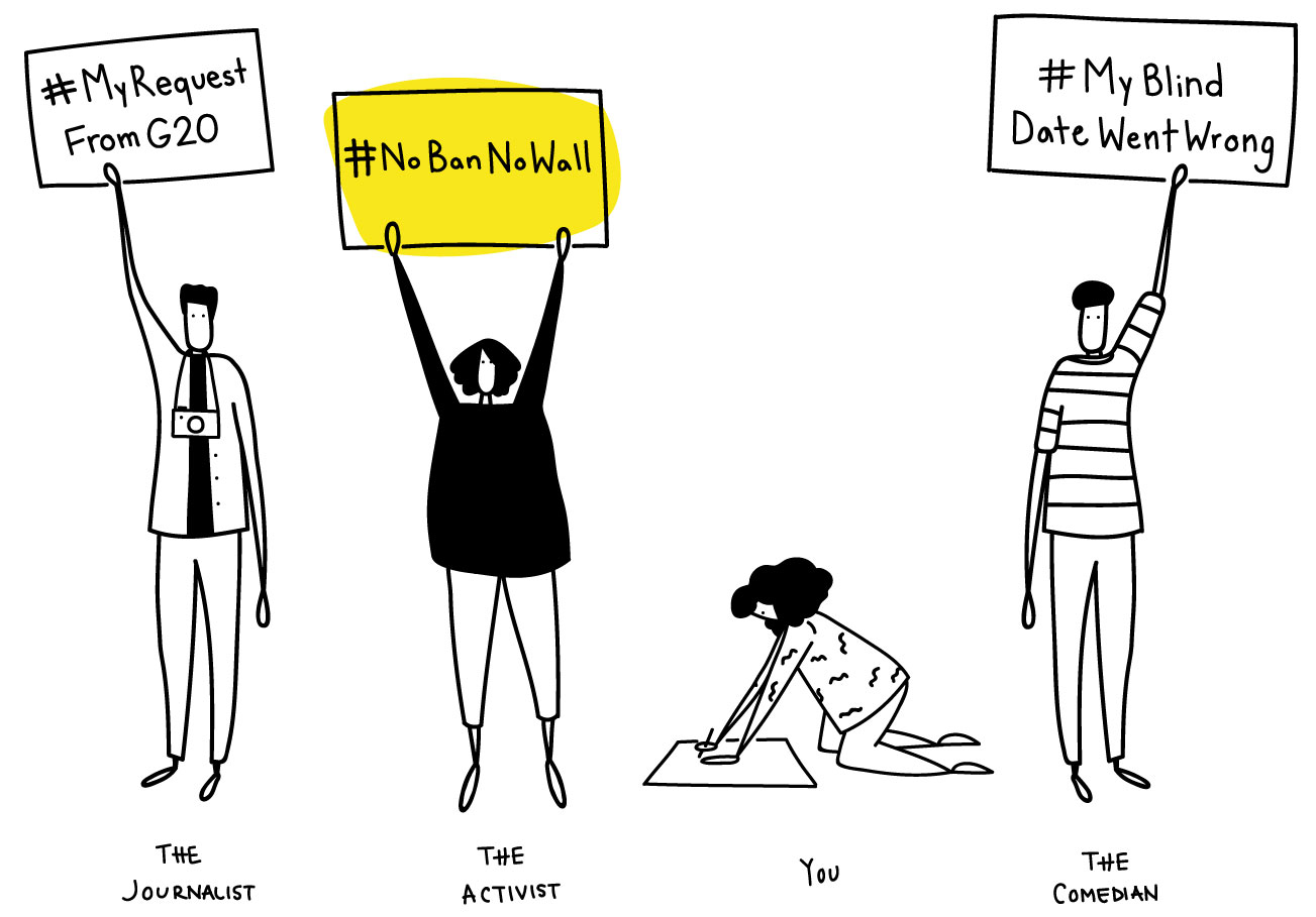
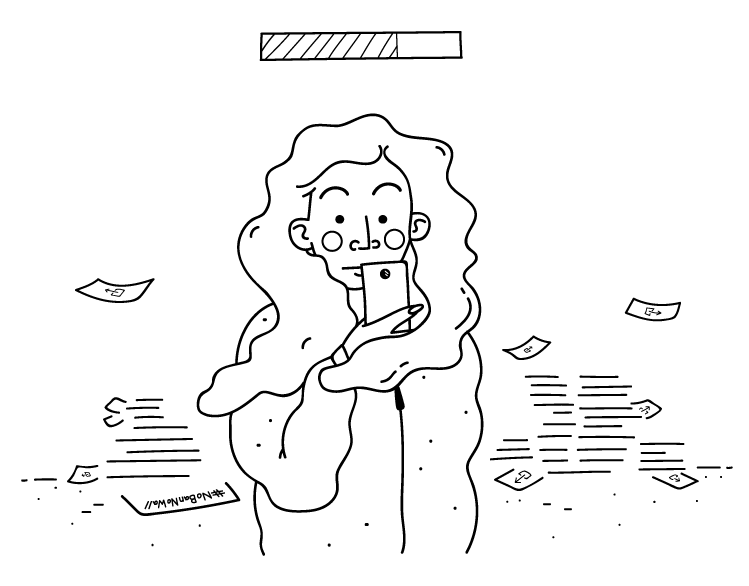
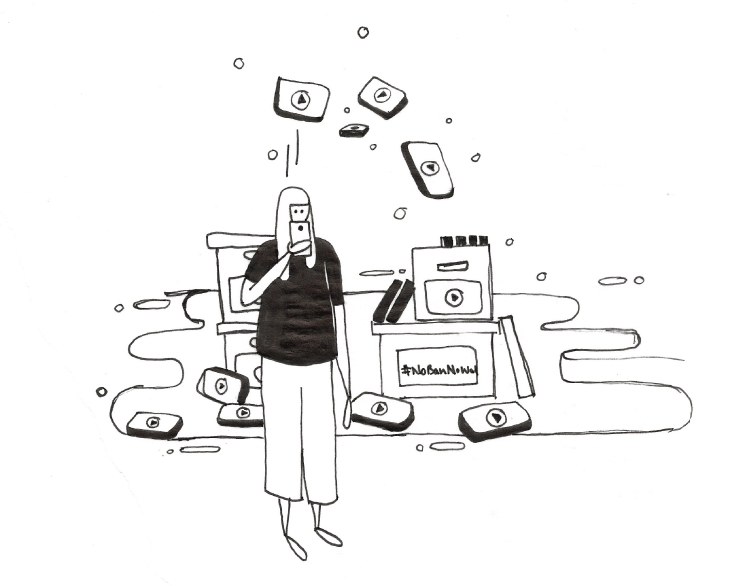


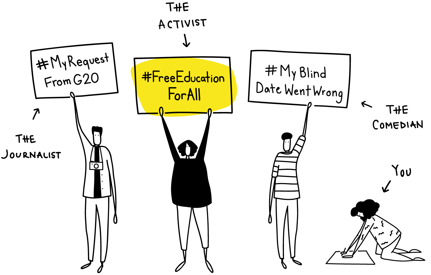
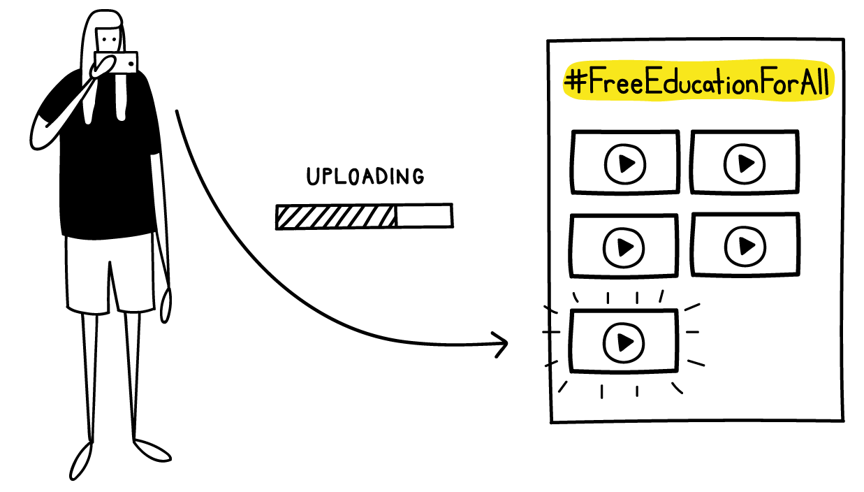
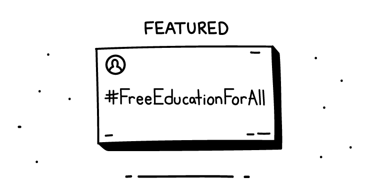
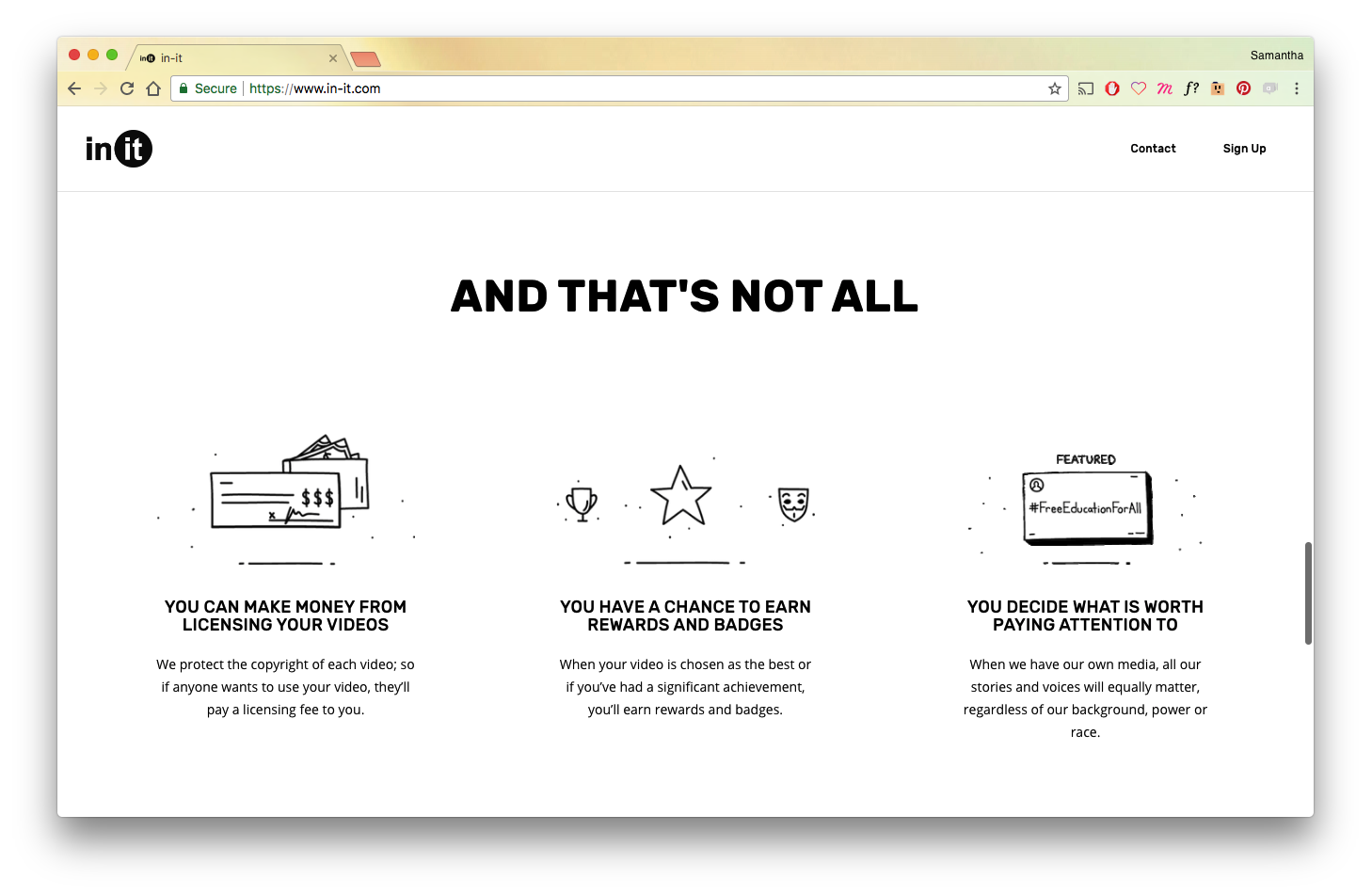
Below are the pre-launch site illustrations that were used to help communicate how the platform works.